The Indian hospitality sector is experiencing unprecedented growth, driven by a surge in domestic and international tourism. The time was right for a new-age brand to emerge—one that isn’t just another hotel but a sanctuary that celebrates the ambitions of its guests while offering them an oasis of comfort. An elegant and modern space with thoughtfully curated services and amenities, Medalio stands out as a pitstop catering to those on a journey to fulfill their dreams. It inculcates a sense of pride and honours guests who have arrived in life as well as those who are on their way.
The challenge was to create an identity that seamlessly blended sophistication with warmth — a space that feels earned, a mark of progress, a milestone in itself.
Our design direction was driven by the ethos of Medalio: aspirational, elegant, yet deeply personal. We envisioned Medalio as a trusted companion—one that recognizes the drive of its ambitious guests, offering them a refined yet effortless space to reset, reflect, and recharge. The challenge was to balance a premium aesthetic with an inviting and warm presence, ensuring that every touchpoint reinforced Medalio’s philosophy of achievement and belonging.
The name 'Medalio' is inspired by the medallion—a universal symbol of success, excellence, and recognition. It conveys a sense of accomplishment and prestige.
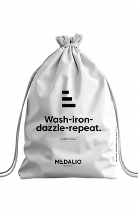
The logo embodies this philosophy. Crafted with geometric precision, its bold lines signify progress and purpose. The branded 'E' within the logo wordmark acts as a distinct brand asset. Designed as a symbol of progress, the laddered E represents a stairway to success for those striving to rise. It is an abbreviated visual shorthand for the logo that can be used independently as a brand mnemonic.
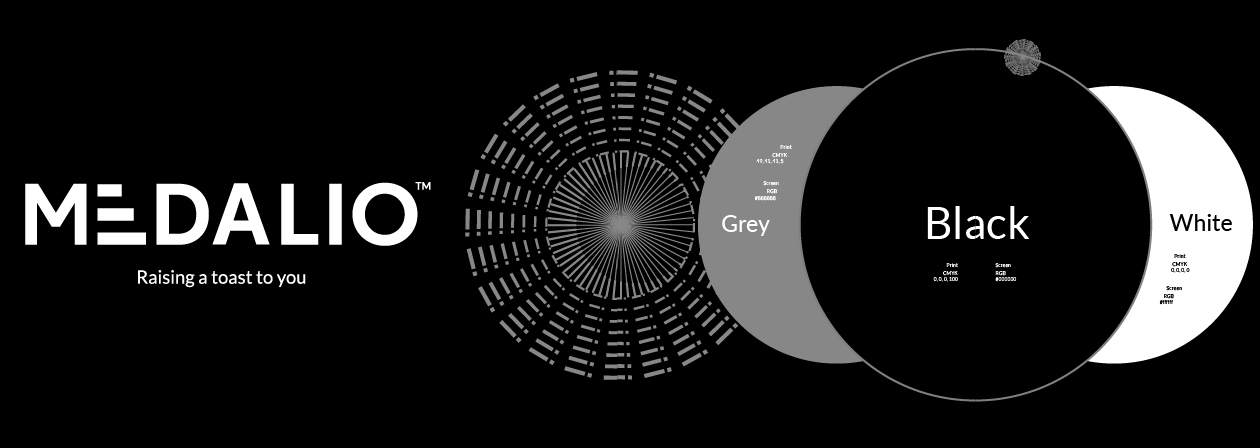
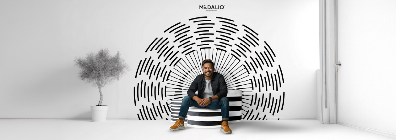
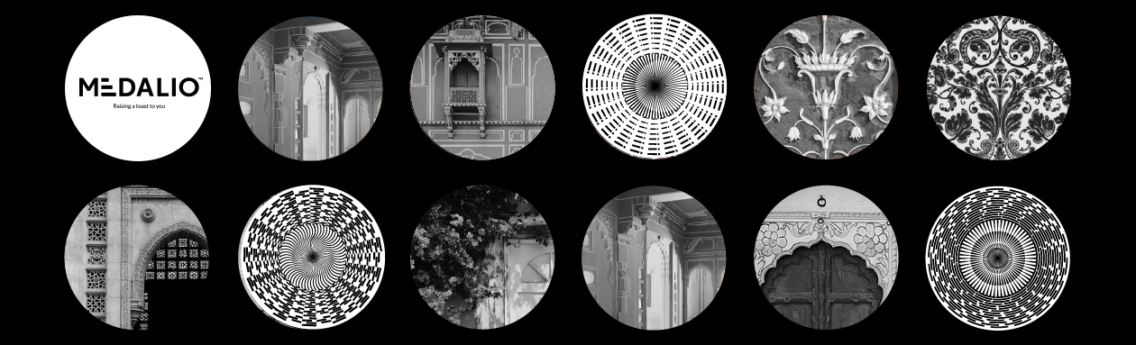
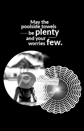
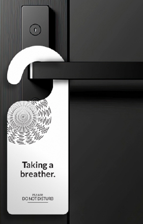
Medalio's identity is built on aspiration, elegance, and warmth. At its core lies the medallion—a symbol of prestige and progress—seamlessly woven into the brand's visual language. To further enrich this identity, we crafted a bank of six custom medallion patterns. These intricate dials with radial geometry, serve multiple purposes — as standalone visual artifacts, background textures, and as visual motors when in motion.
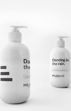
The greyscale color palette establishes a sophisticated yet welcoming aesthetic, reinforcing the brand’s classy persona. Paired with the clean and contemporary typeface, the typography ensures clarity and elegance across all touchpoints. Monochrome photography enhances Medalio’s timeless appeal. Together, these elements create an identity that is not only visually compelling but also deeply symbolic of progress, recognition, and the journey ahead.
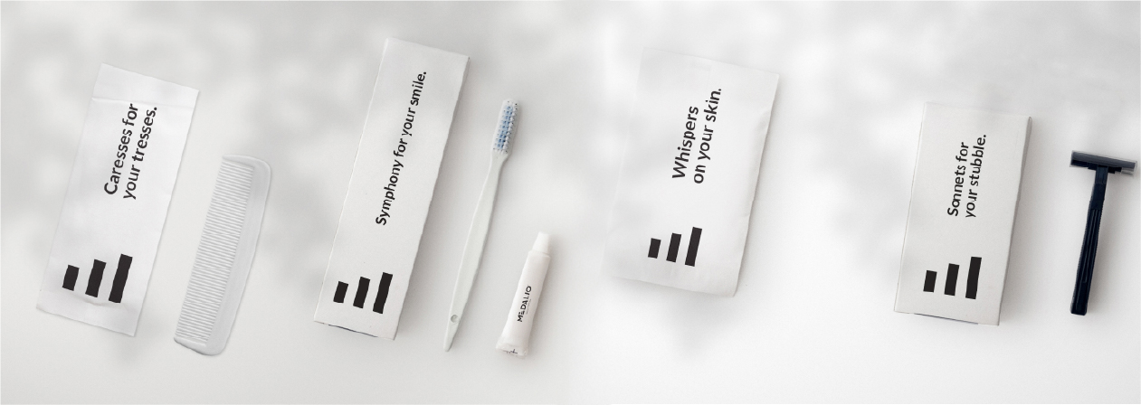
With Medalio, we crafted more than just a hotel brand—we created a sanctuary for achievers, dreamers, and explorers. The brand stands as a testament to progress, a mark of distinction, and a place that truly understands its guests. Through a meticulously designed identity, we ensured that every touchpoint reinforces Medalio as a brand that reassures and empowers — serving as an enabler for guests — offering a space that reflects their ambition, validates their progress, and fuels their aspirations.